

My response was this letter, sent to the 2010 Winter Games organisational committee.
April 24, 2005
To Whom It May Concern:
Count me out.
Hey, I'm as excited as the next guy about the 2010 Winter Games coming to Vancouver. I was one of the first people to sign up in support of the bid, talked about it incessantly with friends and family around the world, and centred lesson plans around the Olympic bid & win once we got the games.
Alas, the new logo sucks.
Sure, the Inukshuk (Inuksuk, in Inuktitut language, for "stone man that points the way") is an indelible symbol of a part of the Canadian identity. Key word here? PART. The weirdest thing is, it's not even this part.
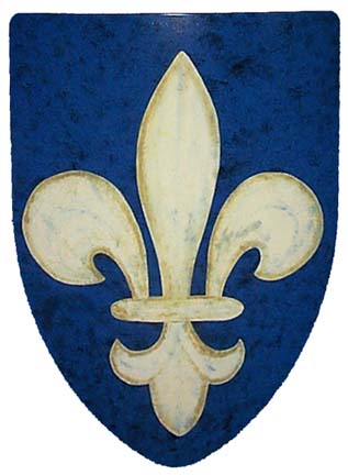
The games aren't in Inuvik, unfortunately for the good Inuit people -- to be honest, I think that would be an amazing venue for a Winter Games -- so how about using a symbol which means something to all Canadians? Can you imagine a games in Nova Scotia built around a fleur-de-lis, sans maple leaf? The inukshuk used here doesn't give even a passing nod to the western venue in which it will be showcased.
As a teacher, I understand the pressure of having all eyes on you. Often, the burden of feeling that you have to please everyone is that you please no one. I hope this is the 2010 Vancouver Olympic Games' growing pains showing through. I pray this is a minor mistake made in lieu of later, larger ones. Your choice for the official logo is a brave and thoughtful one; it's also wholly inappropriate.
1 comment:
right on, Jason! you made some great points, and i particularly admire your example of using the fleur-de-lys. it makes me wonder what the other logo candidates were like.
Post a Comment